A couple of weeks ago I wrote about the maths of social distancing. I hadn’t intended to follow it up, but the article led to a couple of discussions. The day afterwards I sat with a friend for my last tea and cake for some time and produced the following diagram:
Actually, because I can’t draw and I was using a napkin, it wasn’t as pretty, but it does illustrate the problem.
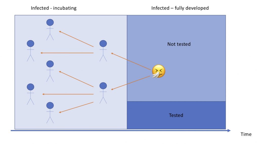
I made the simple assumption that people have to be symptomatic to get a test and to confirm they have the virus. Not only symptomatic, but symptomatic enough to seek treatment. I have some friends who are now sure they have or have had it, but they were not ill enough to go to a doctor. They won’t appear in any official statistics.
It seems clear that that this is minority of those infected. Apparently 80% of people show mild or no symptoms. It is likely that all of the remaining 20% seek treatment and are tested. Probably some of the others do too. So this suggests that the right number might be up to 5x the number. If we assume a similar number to those that are severe get tested that would reduce to 2.5x.
But that’s not all
However, we know it usually takes up to a week for symptoms to show. Hence the left hand side of the diagram above. The dark blue area is the number that we know have tested positive. The light blue area is the estimated number at a similar stage of development.
These people will have transmitted the disease to others. As described last time, that seems to be an average of 2 to 2.5 other people. Its probably fair to assume those who are at the later stage of development have already passed it on.
Unfortunately, Covid-19 is infectious during the incubation phase. These people will already have infected others. Give the short time, probably less than the 2-2.5 that the others have. But this group will also be transmitters too, but a much lower number. And so on. Simply squaring seemed a reasonable assumption. Hence the pale blue area in the diagram.
Multiplying it all together gives 10x to 30x times the stated number as our estimate.
Is this out of date?
Now that all seems sensible, but time has moved on. In the early stages of development that all made sense. But as time passes, an increasing number of those that were incubating will have become fully developed. This brings the multiples down.
Say, that rather than there being 4 to 6.25 incubating people for every fully developed, we bring it down to the R0 of 2 to 2.5. Now the multipliers could be 5x to 12x the stated number. This would make the estimate closer, but still out by an order of magnitude.
But there could be even more infected
However, there is an assumption in there that perhaps isn’t quite right. The above assumes that those with severe symptoms get tested and are counted. This assumes all those who enter the system get tested. The may not be true. The difficulties are illustrated by this BBC article which shows how the UK death count was inexact. It probably still is.
The USA, in particular, has even greater problems. The country has been well behind the curve on testing, with a mixture of lack of test kits and an inability or unwillingness to address it properly within some parts of state or federal government. Inter alia, Calculated Risk has been tracking testing statistics. This shows that the infected proportion of those being tested is increasing. This suggests either the targeting of tests is improving or testing is severely lagging the growth in infections. My money is on the latter.
So those multiples I suggest could be really badly wrong, and wrong the wrong way. True infection numbers in the US could be 100x the declared numbers or more. Several people have suggested that it may be best to ignore the infected numbers as they are so unreliable and focus on deaths as more reliable figure. Which makes sense, but in the early stages it is a lagging indicator.
All this is bad news. I’ve had a discussions with people who have pointed out we are in the fog of war and reliable data is really hard to come by. This makes modelling hard too, so kudos to anyone making a decent stab at things. Even Wired did a much better article than the one that stimulated me to write in the first place.
But the casual reader should be aware how well the official statistics do or do now reflect reality. At the moment, many of them don’t so reader beware!
Addendum – 3 April
I came across this article about estimates of number of infected people in Italy and Spain. The credibility intervals are huge!
Pingback: Why quarantining after flights may not save lives - BM Research